Color grading 101: tell your story with color
Color grading is more than just making your footage look pretty – it's a sophisticated storytelling technique that can evoke emotions, set the mood, and enhance narrative depth. Today's AI tools like text to video even apply automatic color grading to generated videos. In this comprehensive guide, we'll explore how filmmakers use color to create visual masterpieces.
What is Color Grading?
Color grading and color correction are essential techniques in film production. While color correction focuses on technical adjustments like film grain and exposure, color grading transforms raw footage into visually compelling stories - from modern digital looks to classic film noir aesthetics. If you need to isolate your subject to apply distinct color grades to the background independently, an AI background remover can instantly create clean rotoscope mattes. Let's break down the key differences between color correction and grading:
| Color Correction | Color Grading |
|---|---|
| Technical adjustments | Creative decisions |
| Fixes exposure issues | Creates mood and atmosphere |
| Matches shots for continuity | Enhances storytelling elements |
| Foundation work | Artistic expression |
The Psychology of Color in Film
Colors evoke powerful emotional responses. Here's how leading filmmakers use specific colors to tell their stories:
"Color in film is not just what you see, it's what you feel. Every hue should serve the story's emotional core." - Roger Deakins
- Advanced Color Applications
- Yellow
- Psychological impact: Creates anxiety and unease
- Example: "Breaking Bad" - yellow hazmat suits and desert scenes
- Technical approach: Often desaturated to create tension
- Orange
- Common use: Golden hour photography
- Emotional resonance: Nostalgia and warmth
- Popular in: Wes Anderson's symmetrical compositions
- Purple
- Historical significance: Traditional symbol of power
- Modern application: Sci-fi, fantasy genres, and AI character design
- Technical challenge: Requires careful balance in digital color space
- Yellow
Masters of Color: Notable Directors and Their Techniques
Wong Kar-wai: The Poet of Color
Wong Kar-wai's visual storytelling has revolutionized modern cinema through his distinctive use of color. His masterpieces demonstrate an unparalleled understanding of color psychology. With AI-powered video style transfer, creators can now apply cinematic color palettes like these to their own footage:
| Film | Color Palette | Emotional Impact |
|---|---|---|
| In the Mood for Love (2000) | Deep reds, emerald greens | Repressed passion, nostalgia |
| Chungking Express (1994) | Neon blues, urban yellows | Urban isolation, longing |
| Fallen Angels (1995) | High-contrast neons | Night life intensity |
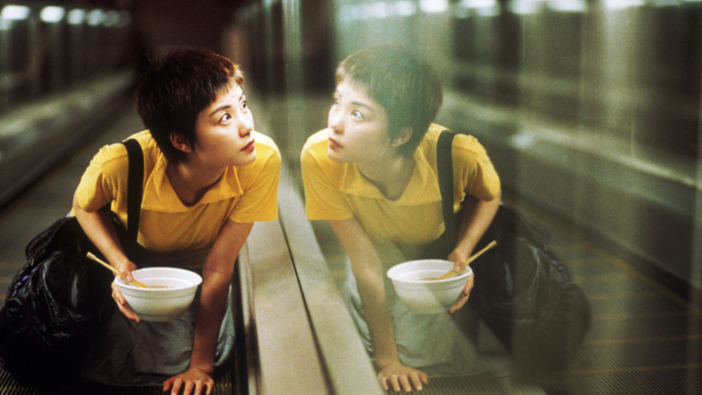
Working closely with cinematographer Christopher Doyle, Wong Kar-wai developed these signature techniques:
Wes Anderson: The Architect of Color
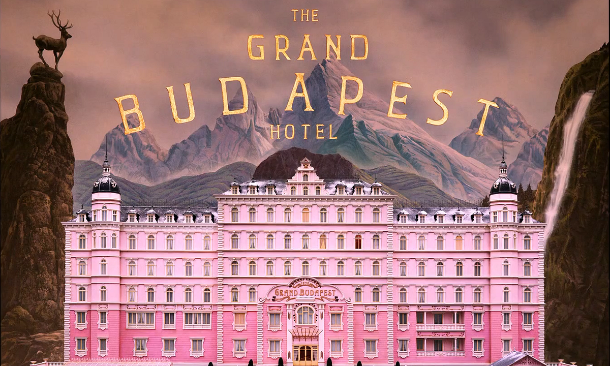
Anderson's meticulously crafted worlds are defined by their precise color coordination:
"Every frame is a painting, every color a deliberate choice." - Robert Yeoman, Anderson's longtime cinematographer
- The Grand Budapest Hotel (2014)
- 1930s: Vibrant pinks and purples
- 1960s: Muted oranges and browns
- 1980s: Cold institutional greens
Roger Deakins: The Digital Pioneer
Deakins' groundbreaking work on "Blade Runner 2049" showcases:
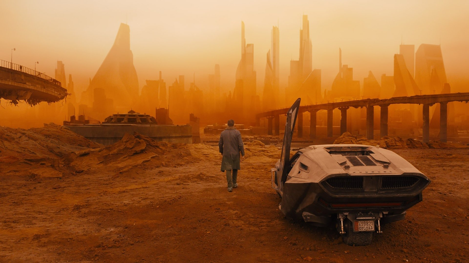
Technical Innovations:
- Custom LUT development for ARRI cameras
- LED lighting integration for real-time color control
- Advanced color space management in video production
- Revolutionary use of atmospheric haze for color separation
Iconic Color Grading in Modern Cinema
La La Land (2016)
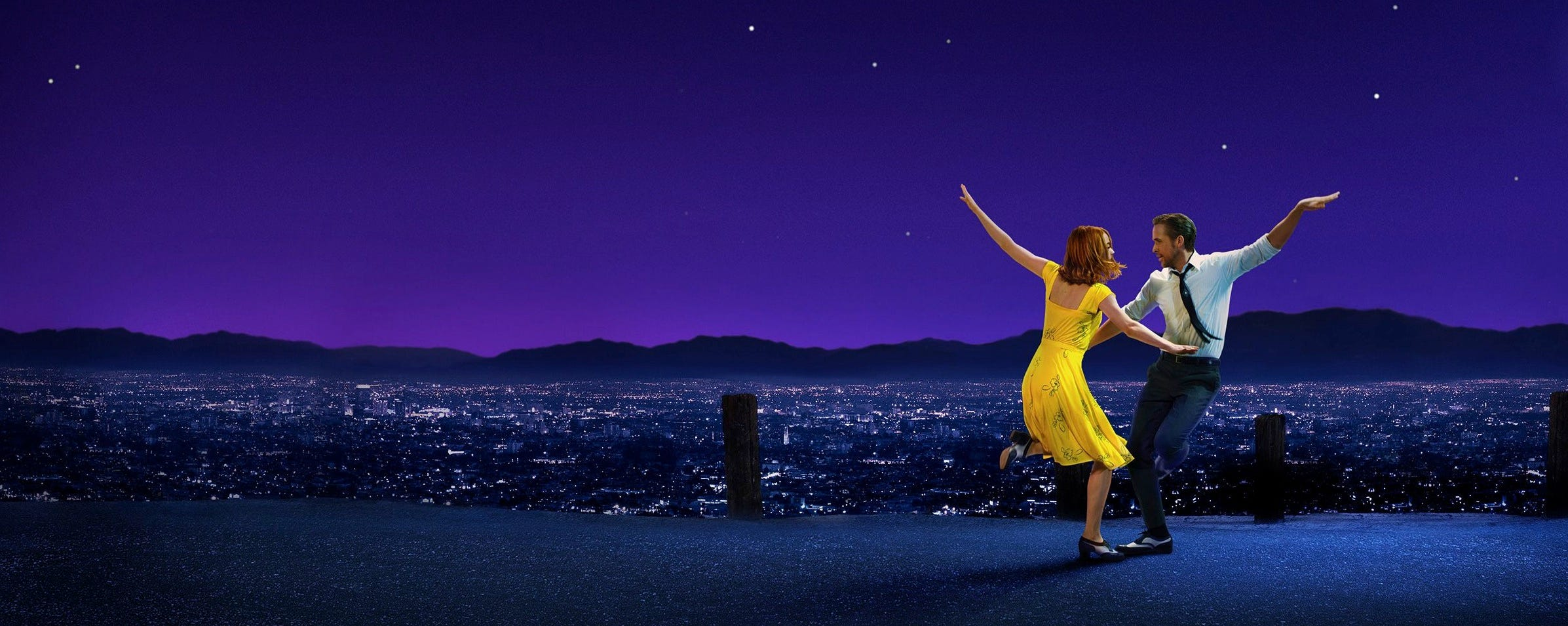
Damien Chazelle's musical masterpiece revolutionized modern color grading:
| Scene | Color Palette | Storytelling Purpose |
|---|---|---|
| Opening Number | Primary colors, saturated sunshine | Hollywood dreams, optimism |
| Jazz Club Scenes | Deep blues, amber spotlights | Traditional jazz atmosphere |
| Planetarium Dance | Twilight purples, starlit blues | Romance, fantasy escape |
"We wanted the colors to feel like a dream of Los Angeles rather than the real thing." - Linus Sandgren, Cinematographer
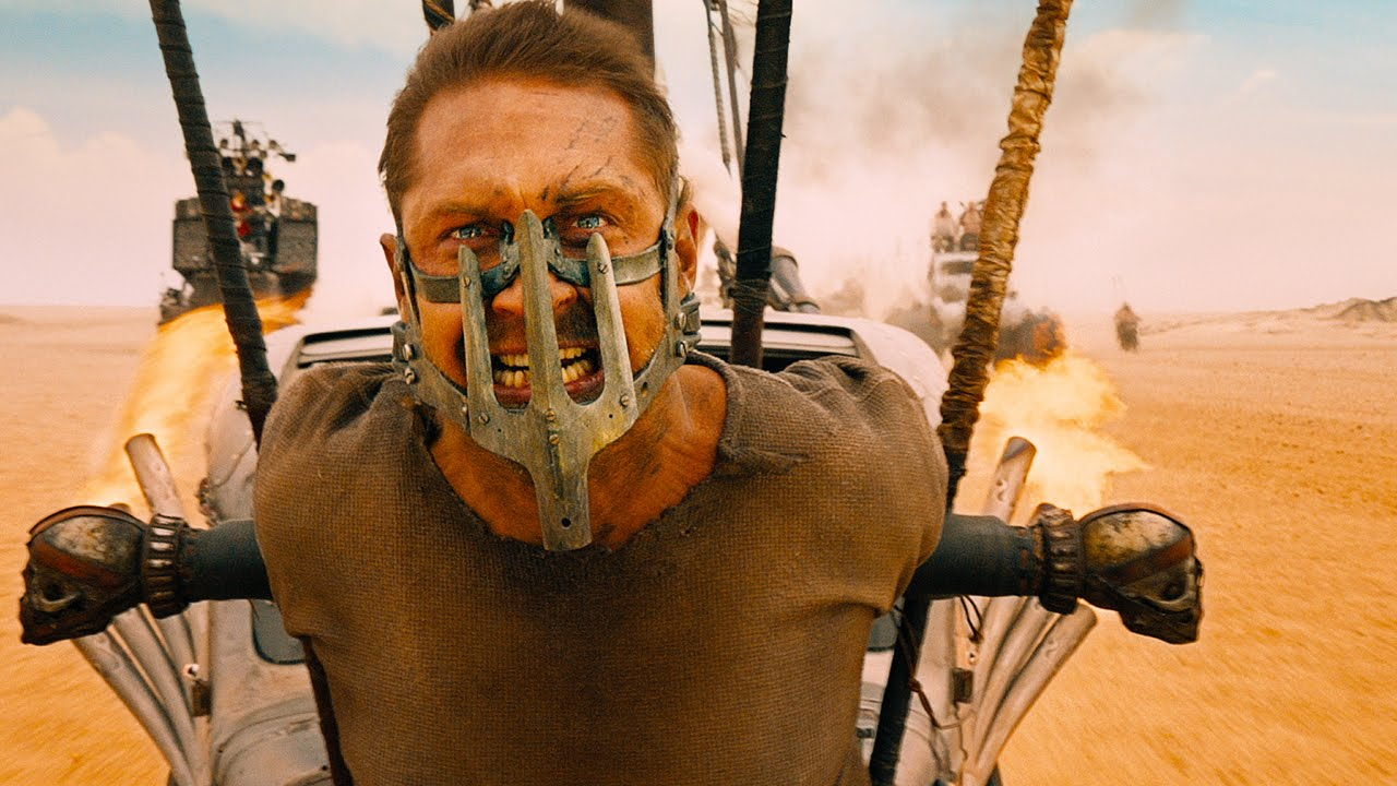
Mad Max: Fury Road (2015)
Technical Achievement: The film required over 150 unique color transformation nodes per scene to achieve its distinctive look.
Whiplash (2014)
Sharone Meir's cinematography employs a sophisticated three-act color structure:
- Act One: Practice Rooms
- Dominant: Tungsten warmth (3200K)
- Highlights pushed to yellow-green
- Shadows crushed for claustrophobia
- Dominant: Tungsten warmth (3200K)
- Act Two: Performance Scenes
- Rich amber spotlights (RGB: 255, 191, 0)
- Desaturated audience areas (-40%)
- High contrast ratios (8:1)
- Act Three: Final Performance
- Dynamic range expanded to 14 stops
- Selective vignetting on close-ups
- Golden highlights (RGB: 218, 165, 32)
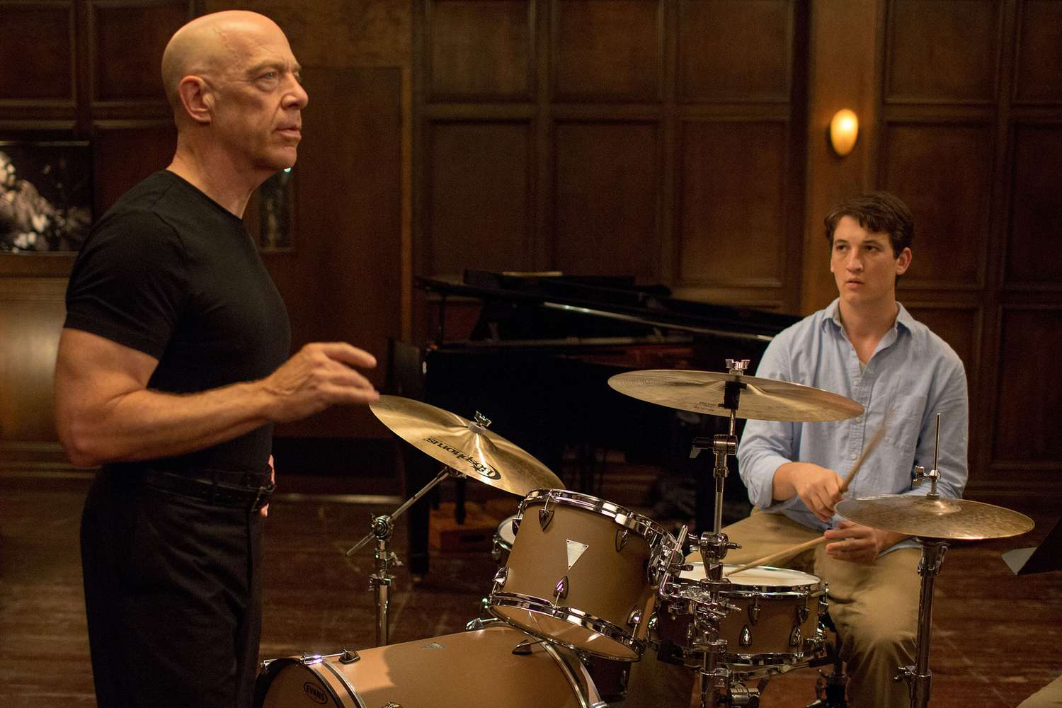
"We treated every frame like a jazz composition - tension and release through light and color." - Tom Cross, Editor
Technical Aspects of Color Grading
Essential Color Grading Tools
Once your grade is locked, use an AI video upscaler to enhance the final render's resolution and sharpness before delivery.
| Tool Category | Features | Common Applications |
|---|---|---|
| Primary Controls | Color wheels, RGB mixers | Overall image balance, establishing base look (or use Seedance 2.0 for baseline coloring) |
| Secondary Controls | HSL qualifiers, curves | Specific color adjustments, fine detail work |
| Technical Tools | Vectorscopes, waveforms | Color accuracy, broadcast compliance |
Professional Grading Techniques
"The most powerful grades often come from the subtlest adjustments." - Stefan Sonnenfeld, Company 3
- Split-Toning Mastery
- Shadows: Cool tones (RGB: 44, 66, 81)
- Highlights: Warm accents (RGB: 255, 214, 170)
- Midtone detail preservation (±15% contrast)
- Advanced Color Theory Application
- Complementary color grading (180° on color wheel)
- Analogous schemes for subtle emotion
- Triadic harmony for dynamic scenes
Building Your Signature Style
| Project Phase | Color Considerations | Technical Requirements |
|---|---|---|
| Pre-Production | Mood boards (via text-to-image), color scripts | Camera tests, LUT creation |
| Production | On-set monitoring | Color-managed workflow |
| Post-Production | Scene matching, look refinement | Calibrated displays, render specs |
Critical Technical Pitfalls
"The difference between amateur and professional work often lies in knowing what not to do." - Maxine Gervais, Senior Colorist
- Common Technical Errors
- Crushed blacks below 0 IRE
- Highlight clipping above 100 IRE
- 4:2:0 chroma subsampling limitations
- Gamut boundary violations
Conclusion
Color grading is a powerful tool that, when used thoughtfully, can elevate your storytelling to new heights. Whether you're aiming for Wong Kar-wai's neon-soaked nostalgia or Wes Anderson's precise pastel perfection, remember that color should always serve your story first. Experiment with your color vision using Morph Studio, where AI handles technical complexity so you can focus on creativity.
The most successful color grades are those that audiences don't consciously notice but feel deeply. As you develop your color grading skills, focus on creating looks that enhance your narrative rather than distract from it.